The method applied for the analysis is the same as for the Ranking widget .
These widgets will help you spot possible recurring events during certain weekdays or times of the day that improve or worsen your results. The hourly widget is displayed when the time filter applied to the report is either "Last Week" or "Last Month", and the weekly pattern when the time filter is "Last Month".
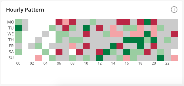
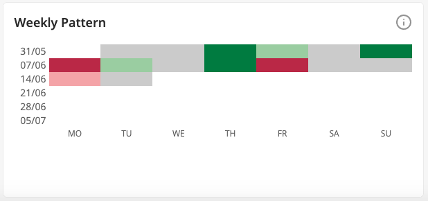
How to read the chart:
- The darker green the color, the better the results compared to the average results for the period.
- The darker red the color, the worse the results compared to the average for the period.
- Grey color means average results.
- White color means either no results for the given period or the period is out of reporting range.
Topics